Tailwind v4 + Shadcn UI: Xây Design System cho Next.js từ A đến Z
Từ CSS-first config của Tailwind v4 đến copy-paste components của Shadcn cách mình setup styling layer cho mọi dự án Next.js.
Nguyễn Nhật Long
@nguyennhatlong1303

Mình đã dùng qua khá nhiều cách để handle styling trong React/Next.js từ plain CSS, CSS Modules, styled-components, cho đến Tailwind. Và sau vài năm production, mình nhận ra rằng không có cái nào là "đúng hoàn toàn" nhưng có một stack mà mình cứ quay lại hoài: Tailwind CSS + Shadcn UI. Bài này mình sẽ chia sẻ cách mình setup cái design system đó từ đầu cho một dự án Next.js, cùng với những trade-off mà bạn nên biết trước khi commit.
Tailwind v4 thay đổi khá nhiều thứ
Nếu bạn đã dùng Tailwind v3, thì v4 có một điểm khác biệt lớn: không còn tailwind.config.js nữa. Toàn bộ config giờ nằm trong CSS file, dùng @theme directive. Nghe lạ nhưng thực ra rất gọn.
Thay vì file config JavaScript lằng nhằng, bạn chỉ cần:
1@import 'tailwindcss';23@theme {4 --color-primary: #6366f1;5 --color-primary-foreground: #ffffff;6 --font-sans: 'Inter', sans-serif;7 --radius: 0.5rem;8}
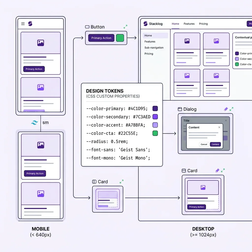
Một dòng @import 'tailwindcss' là xong không cần @tailwind base, @tailwind components, @tailwind utilities riêng lẻ như trước. Cái @theme block chính là nơi bạn define design tokens của mình: màu sắc, font, border radius, spacing scale,...
Mình thấy cái này hay ở chỗ: design tokens giờ là CSS variables thực sự. Nghĩa là bạn có thể access chúng từ bất kỳ đâu, kể cả trong JavaScript nếu cần, và dark mode cũng handle rất tự nhiên:
1@theme {2 --color-background: #ffffff;3 --color-foreground: #0f0f0f;4}56.dark {7 --color-background: #0f0f0f;8 --color-foreground: #fafafa;9}
Dùng class strategy cho dark mode (class thay vì media) cho phép bạn toggle theme bằng JavaScript cần thiết khi muốn có nút switch theme.
cn() cái utility nhỏ mà không thể thiếu
Trước khi nói đến Shadcn, phải nói cái này. cn() là một helper function kết hợp clsx và tailwind-merge:
1npm install clsx tailwind-merge
1import { clsx, type ClassValue } from 'clsx';2import { twMerge } from 'tailwind-merge';34export function cn(...inputs: ClassValue[]) {5 return twMerge(clsx(inputs));6}
Tại sao cần cả hai? clsx xử lý conditional classes, còn tailwind-merge giải quyết conflict khi merge. Ví dụ:
1// Không dùng tailwind-merge2cn('px-4', 'px-6') // → 'px-4 px-6' ❌ conflict, px-4 vẫn còn đó34// Dùng tailwind-merge5cn('px-4', 'px-6') // → 'px-6' ✅ class sau override class trước67// Conditional8cn('px-4 py-2 rounded', isActive && 'bg-primary text-white', isDisabled && 'opacity-50 cursor-not-allowed')
Theo kinh nghiệm của mình, cái này cực kỳ quan trọng khi build reusable components. Không có tailwind-merge, bạn sẽ gặp bug styling kỳ lạ khi pass className vào component từ bên ngoài.
Shadcn UI đừng gọi nó là component library
Đây là điểm mà nhiều người hay hiểu nhầm. Shadcn không phải một npm package mà bạn install rồi import. Nó là một bộ components mà bạn copy thẳng source code vào project.
1# Init shadcn trong project2npx shadcn@latest init34# Add từng component bạn cần5npx shadcn@latest add button6npx shadcn@latest add dialog7npx shadcn@latest add select
Sau khi chạy lệnh này, bạn sẽ thấy file components/ui/button.tsx xuất hiện trong project và bạn có thể sửa trực tiếp. Đây chính là điểm mạnh nhất của Shadcn: bạn own hoàn toàn code đó.
Bên dưới hood, Shadcn dùng Radix UI primitives một bộ headless components cực kỳ accessible. Radix lo hết phần keyboard navigation, ARIA attributes, focus management,... còn Shadcn wrap lại với Tailwind styles cho đẹp. Bạn get được cả hai: accessibility miễn phí + UI đẹp + full control.
1// components/ui/button.tsx bạn có thể modify thoải mái2import { Slot } from '@radix-ui/react-slot';3import { cva, type VariantProps } from 'class-variance-authority';4import { cn } from '@/lib/utils';56const buttonVariants = cva(7 'inline-flex items-center justify-center rounded-md text-sm font-medium transition-colors focus-visible:outline-none focus-visible:ring-2 disabled:pointer-events-none disabled:opacity-50',8 {9 variants: {10 variant: {11 default: 'bg-primary text-primary-foreground hover:bg-primary/90',12 destructive: 'bg-destructive text-destructive-foreground hover:bg-destructive/90',13 outline: 'border border-input bg-background hover:bg-accent',14 ghost: 'hover:bg-accent hover:text-accent-foreground',15 },16 size: {17 default: 'h-10 px-4 py-2',18 sm: 'h-9 rounded-md px-3',19 lg: 'h-11 rounded-md px-8',20 icon: 'h-10 w-10',21 },22 },23 defaultVariants: {24 variant: 'default',25 size: 'default',26 },27 }28);2930export interface ButtonProps31 extends React.ButtonHTMLAttributes<HTMLButtonElement>,32 VariantProps<typeof buttonVariants> {33 asChild?: boolean;34}3536export const Button = ({ className, variant, size, asChild = false, ...props }: ButtonProps) => {37 const Comp = asChild ? Slot : 'button';38 return <Comp className={cn(buttonVariants({ variant, size, className }))} {...props} />;39};
Anh em lưu ý cái cva (class-variance-authority) đây là pattern để define variants cho component. Thay vì if-else lằng nhằng, bạn declare variants rõ ràng và type-safe.
Chọn styling approach nào?
Mình biết câu hỏi này hay được đặt ra, nên để thẳng vào bảng so sánh cho dễ nhìn:
Theo kinh nghiệm của mình, styled-components hay emotion đều có một vấn đề lớn với Next.js App Router: chúng là client-side runtime, nên không chơi đẹp với Server Components. Bạn phải add 'use client' vào nhiều chỗ hơn cần thiết. Tailwind thì không có vấn đề này nó generate static CSS, Server Components dùng thoải mái.
| Tailwind CSS | CSS Modules | styled-components | |
|---|---|---|---|
| **Bundle size** | Nhỏ (purge unused) | Trung bình | Lớn (runtime JS) |
| **Dev experience** | Nhanh, inline | Gọn, separate file | Tốt, dynamic dễ |
| **SSR với Next.js** | Hoàn hảo | Hoàn hảo | Cần config thêm |
| **Colocation** | Inline với JSX | File riêng `.module.css` | Inline với JS |
| **Dynamic styling** | Cần cn() + variants | Cần JS thêm | Native, dễ nhất |
| **Learning curve** | Medium | Thấp | Medium |
| **Theming** | CSS variables | CSS variables | ThemeProvider |
CSS Modules vẫn là lựa chọn tốt nếu team bạn không muốn học Tailwind. Nhưng khi scale lên, việc maintain naming convention và tránh conflict class name bắt đầu tốn effort.
Font với next/font
Đừng load Google Fonts bằng <link> tag trong HTML. Next.js có next/font tự host font trên server của bạn, không có request ra ngoài, không layout shift:
1// app/layout.tsx2import { Inter, Geist_Mono } from 'next/font/google';34const inter = Inter({5 subsets: ['latin'],6 variable: '--font-sans',7 display: 'swap',8});910const geistMono = Geist_Mono({11 subsets: ['latin'],12 variable: '--font-mono',13 display: 'swap',14});1516export default function RootLayout({ children }: { children: React.ReactNode }) {17 return (18 <html lang="vi" className={`${inter.variable} ${geistMono.variable}`}>19 <body>{children}</body>20 </html>21 );22}
Bằng cách expose font như CSS variable (--font-sans), bạn có thể reference nó trong Tailwind theme config và dùng như font-sans utility class. Consistent hoàn toàn.
Responsive mobile-first không phải chỉ là trend
Tailwind theo mobile-first: base styles áp dụng cho mobile, breakpoints mở rộng lên:
1<div className="2 flex flex-col gap-4 // mobile: stack dọc3 md:flex-row md:gap-8 // tablet+: ngang4 lg:grid lg:grid-cols-3 // desktop: 3 cột5">
Một pattern mình hay dùng là container queries khi bạn muốn component responsive theo container của nó, không phải theo viewport:
1.card-container {2 container-type: inline-size;3}45@container (min-width: 400px) {6 .card {7 display: flex;8 flex-direction: row;9 }10}
Cái này đặc biệt useful khi build component library component không biết nó sẽ được đặt ở đâu trong layout, nên responsive theo container sẽ predictable hơn.
Ghép lại thành một design system thực tế
Cái mình thường setup cho một project mới trông như thế này:
1app/2 globals.css ← @import tailwindcss + @theme tokens3 layout.tsx ← font setup4components/5 ui/ ← shadcn components (auto-generated)6 button.tsx7 dialog.tsx8 ...9 shared/ ← custom components của project10 navbar.tsx11 footer.tsx12lib/13 utils.ts ← cn() helper
Globals.css sẽ là nơi tập trung toàn bộ design tokens màu sắc brand, typography scale, spacing, border radius. Shadcn components reference đến các tokens này qua CSS variables, nên khi bạn đổi một màu trong @theme, toàn bộ UI update theo.
Mình thấy cái stack này scale khá tốt từ side project nhỏ đến team 10+ người. Shadcn cho bạn điểm khởi đầu tốt với components đã accessible, Tailwind giữ bundle nhỏ và dev experience nhanh, còn CSS variables giữ theming consistent. Không perfect, nhưng pragmatic và đó là thứ mình tìm kiếm trong một production stack.
Nguyễn Nhật Long
@nguyennhatlong1303Nguyễn Nhật Long is a Senior Frontend Engineer and Frontend Team Leader with 7 years of experience building real-time fintech platforms. Specializing in React, Next.js, TypeScript, and React Native, shipping 10+ products across Web, Mobile, Telegram Mini-Apps, and Web3.
Thấy hay? Chia sẻ cho bạn bè!